SteelCase
UX/UI & App Design
ThriveAP is a leading healthcare education platform offering CME/CE programs for nurse practitioners and physician assistants. The project focused on redesigning the digital experience to simplify complex program enrollment, improve content discoverability, and create a professional interface that reflects the platform's commitment to advancing clinical education.
A comprehensive design system was developed to bring consistency and scalability across every touchpoint. The system defines typography, color palettes, spacing, and component patterns — creating a unified visual language that reinforces ThriveAP's credibility in the healthcare education space.
Each component was designed for flexibility, allowing the marketing and product teams to build new pages and features without compromising brand integrity. The system balances clinical professionalism with approachable warmth, using a refined color palette and clear typographic hierarchy.
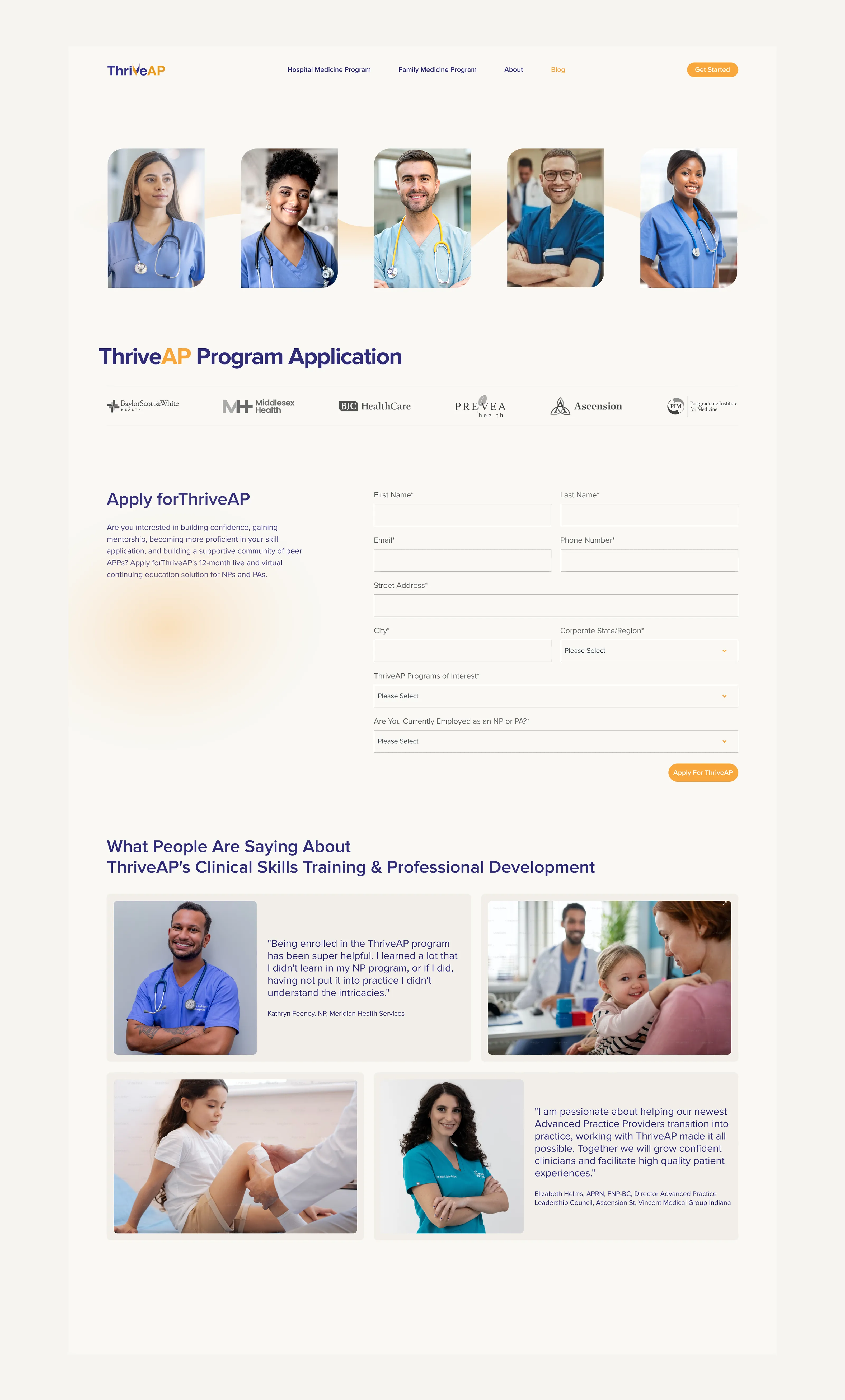
The product design focused on creating a modular system that could accommodate ThriveAP's expanding program catalog. Each program page follows a consistent template while allowing for unique content — balancing scalability with the need for differentiation between offerings like the Hospital Medicine and Family Medicine programs.
Interactive elements were designed to guide users through multi-step processes without overwhelming them. Progress indicators, contextual help, and responsive form design ensure that enrollment feels straightforward whether accessed from a desktop during a break or a mobile device between shifts.
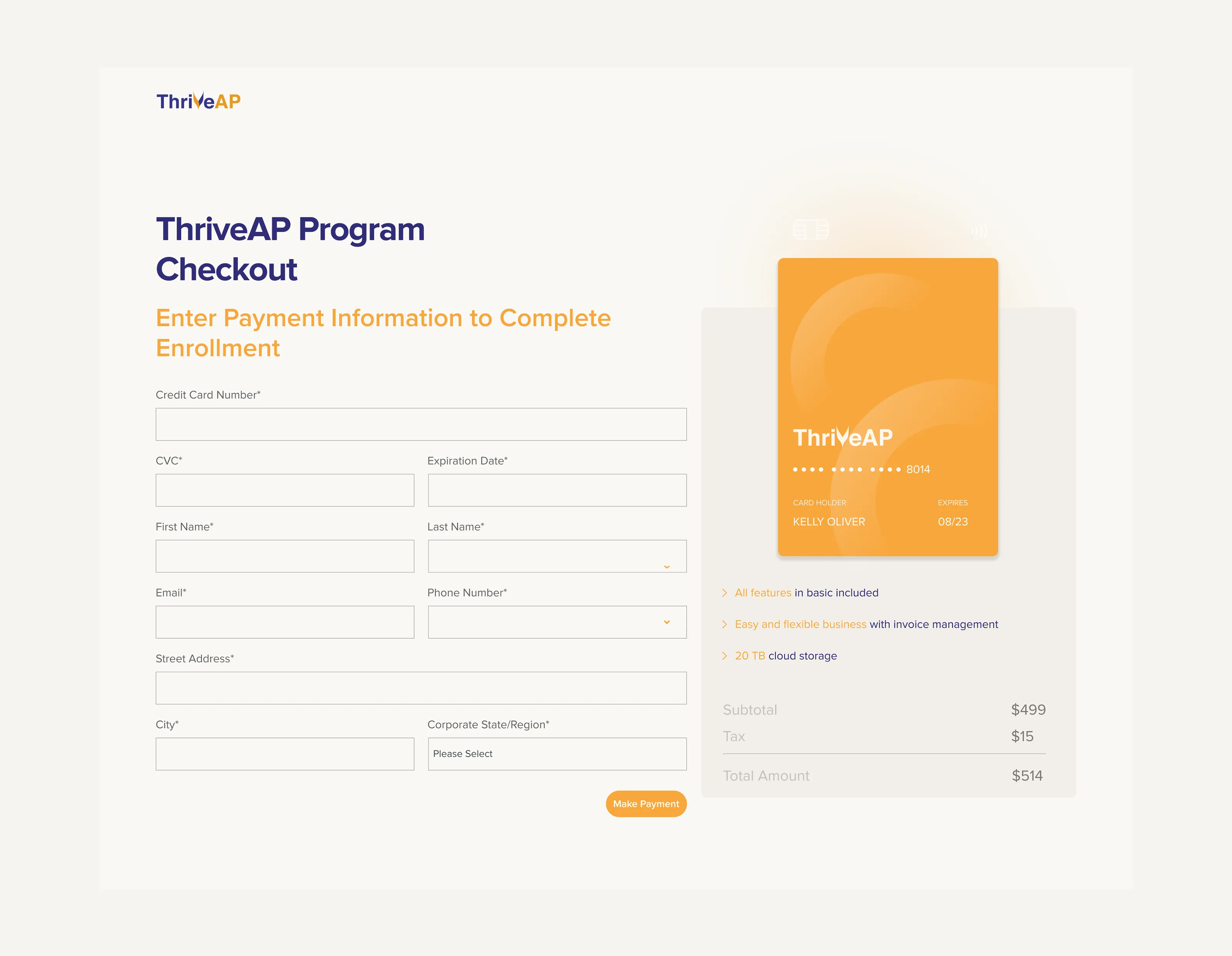
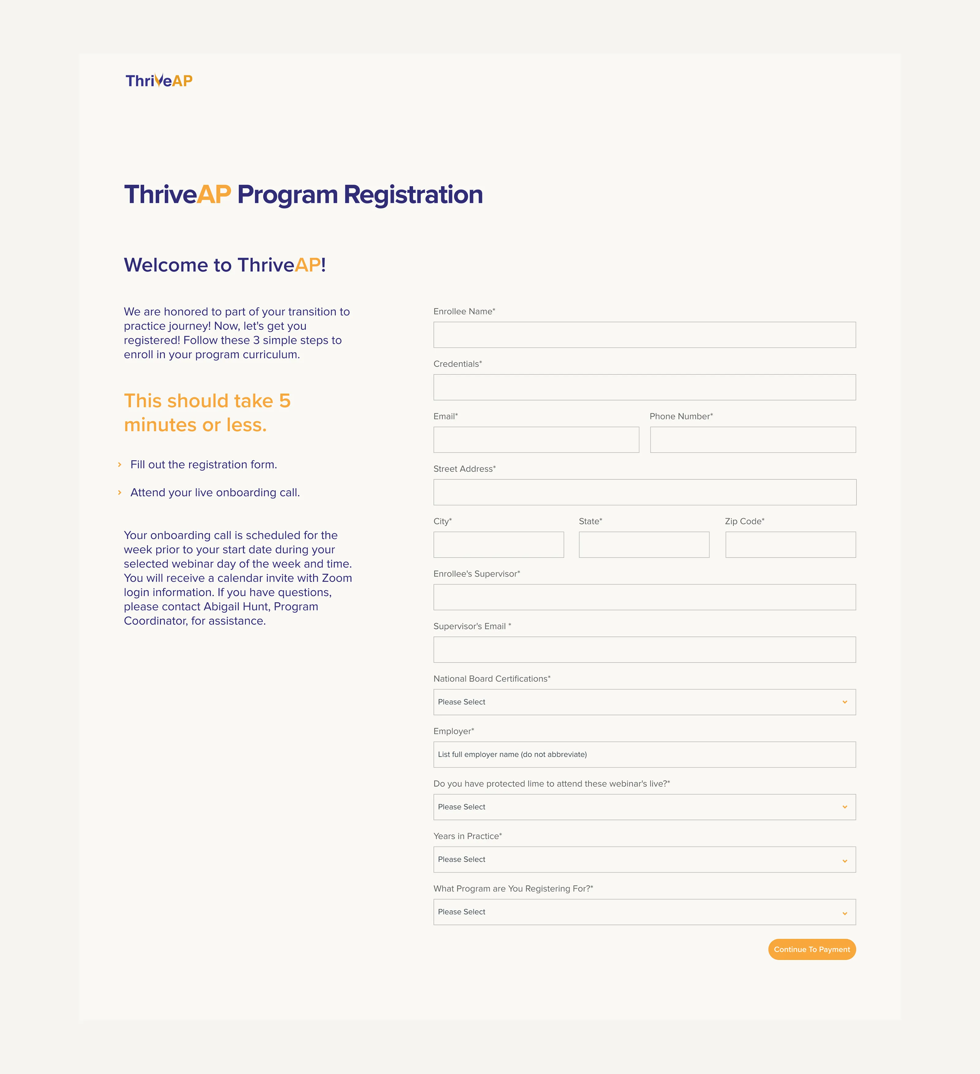
The redesign began with a deep analysis of the existing user journey. Healthcare professionals navigating continuing education have limited time and specific needs — the interface had to respect both. Every interaction was streamlined to reduce cognitive load, from program discovery to enrollment completion.
A clear information hierarchy was established across all pages, with consistent navigation patterns and strategic use of white space to guide attention. The goal was to make a content-heavy platform feel approachable and easy to navigate, regardless of the user's technical comfort level.