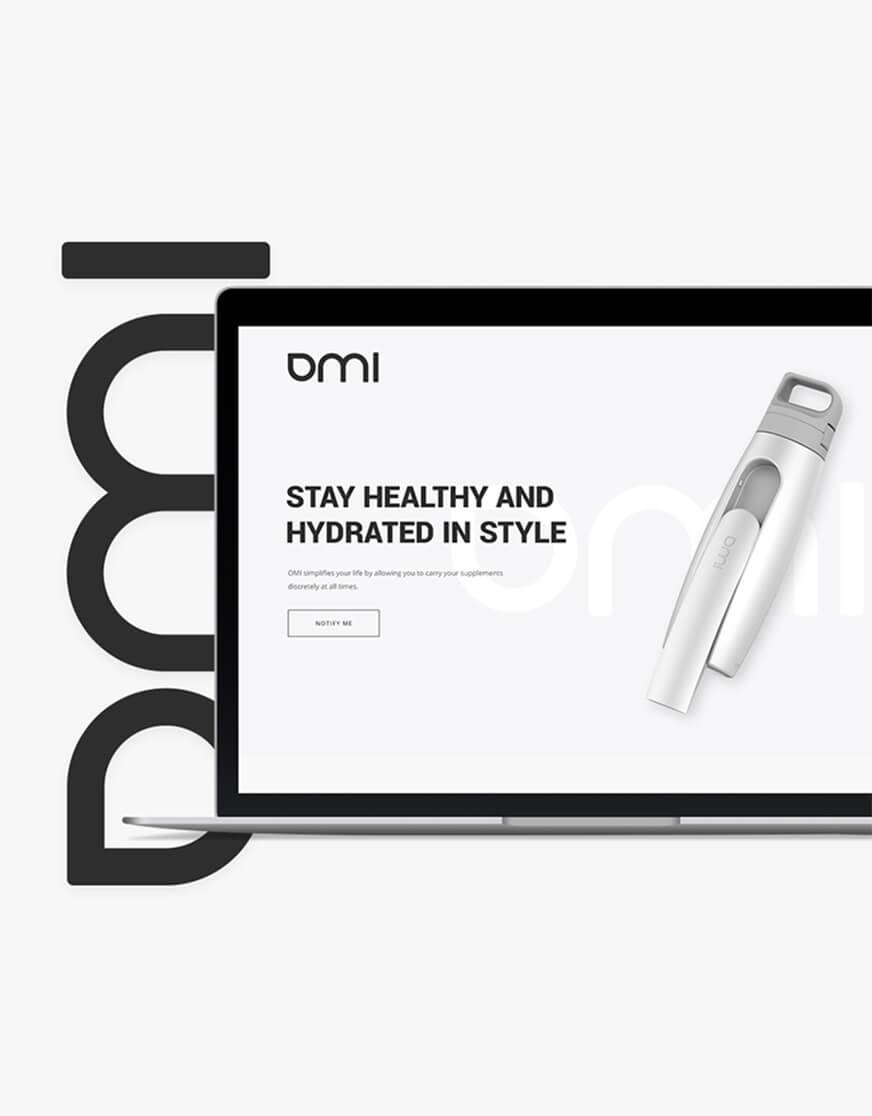
Signal
Branding & Web Design
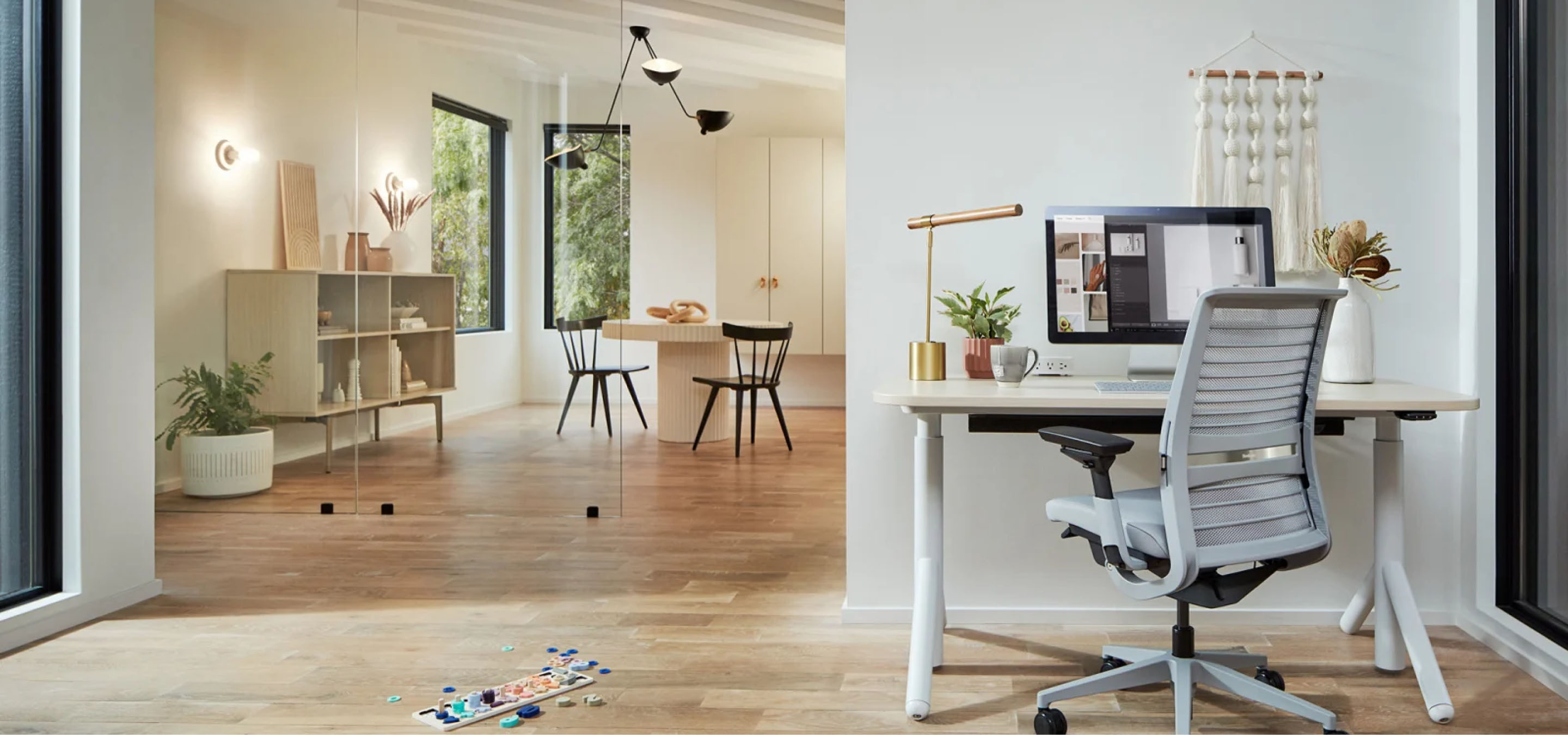
A comprehensive redesign of the Steelcase mobile experience — reimagining how customers browse, configure, and purchase workplace furniture through a refined, intuitive interface built for clarity and conversion.
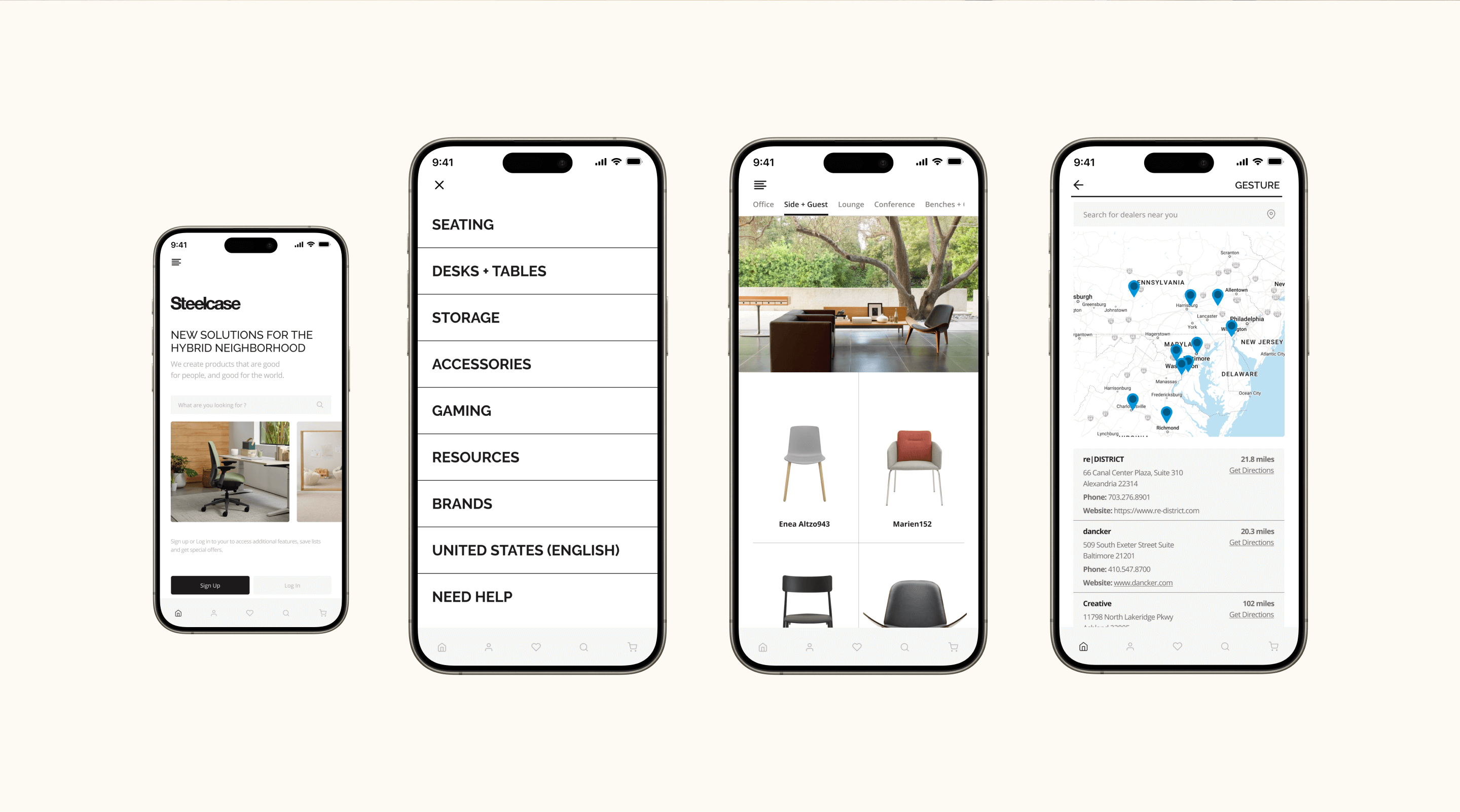
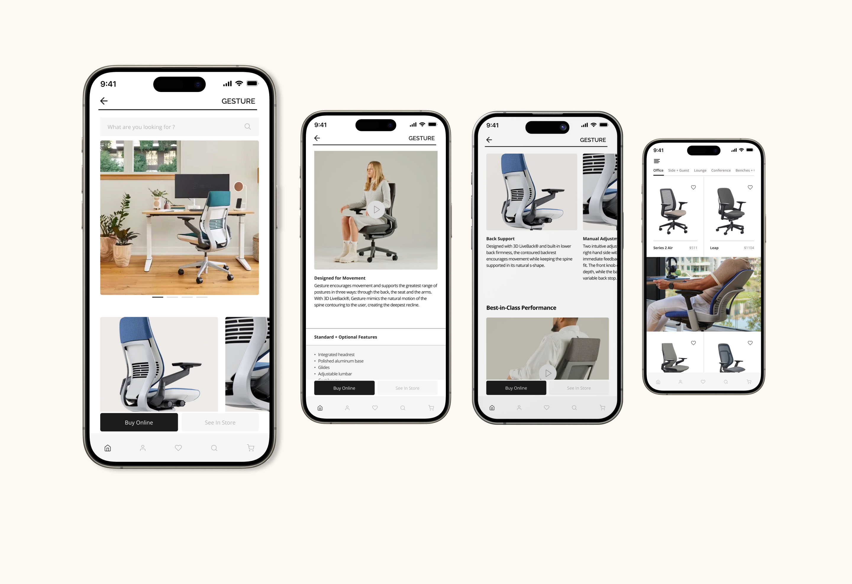
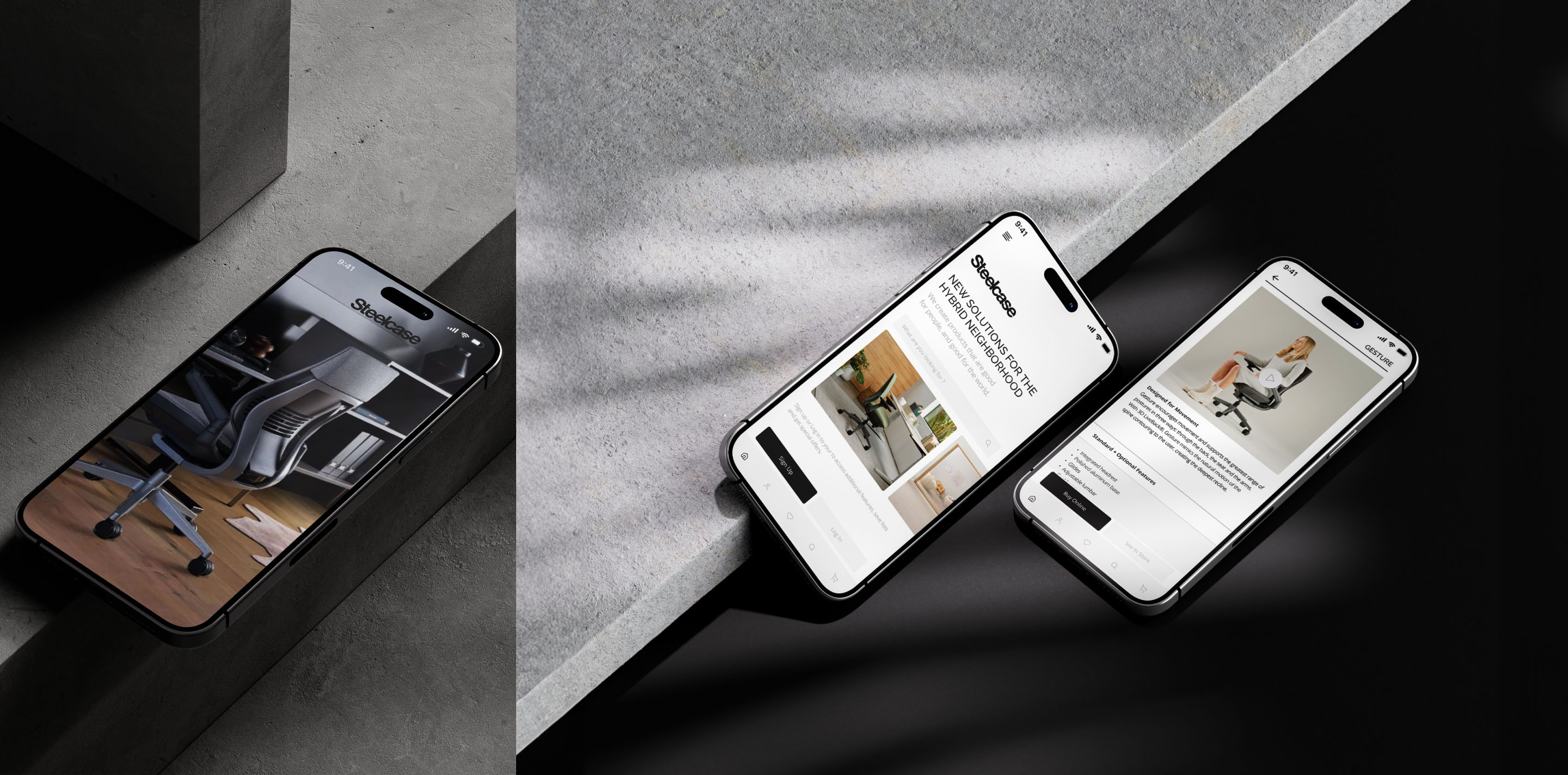
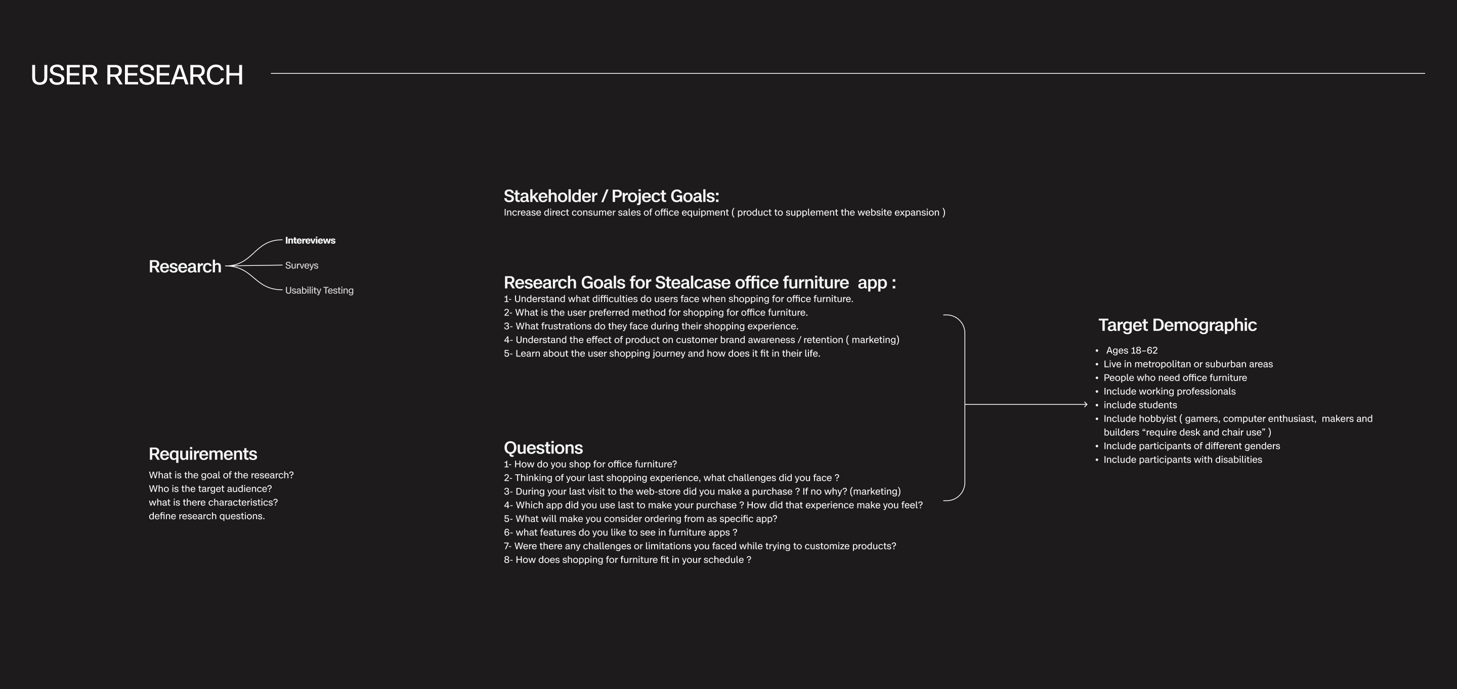
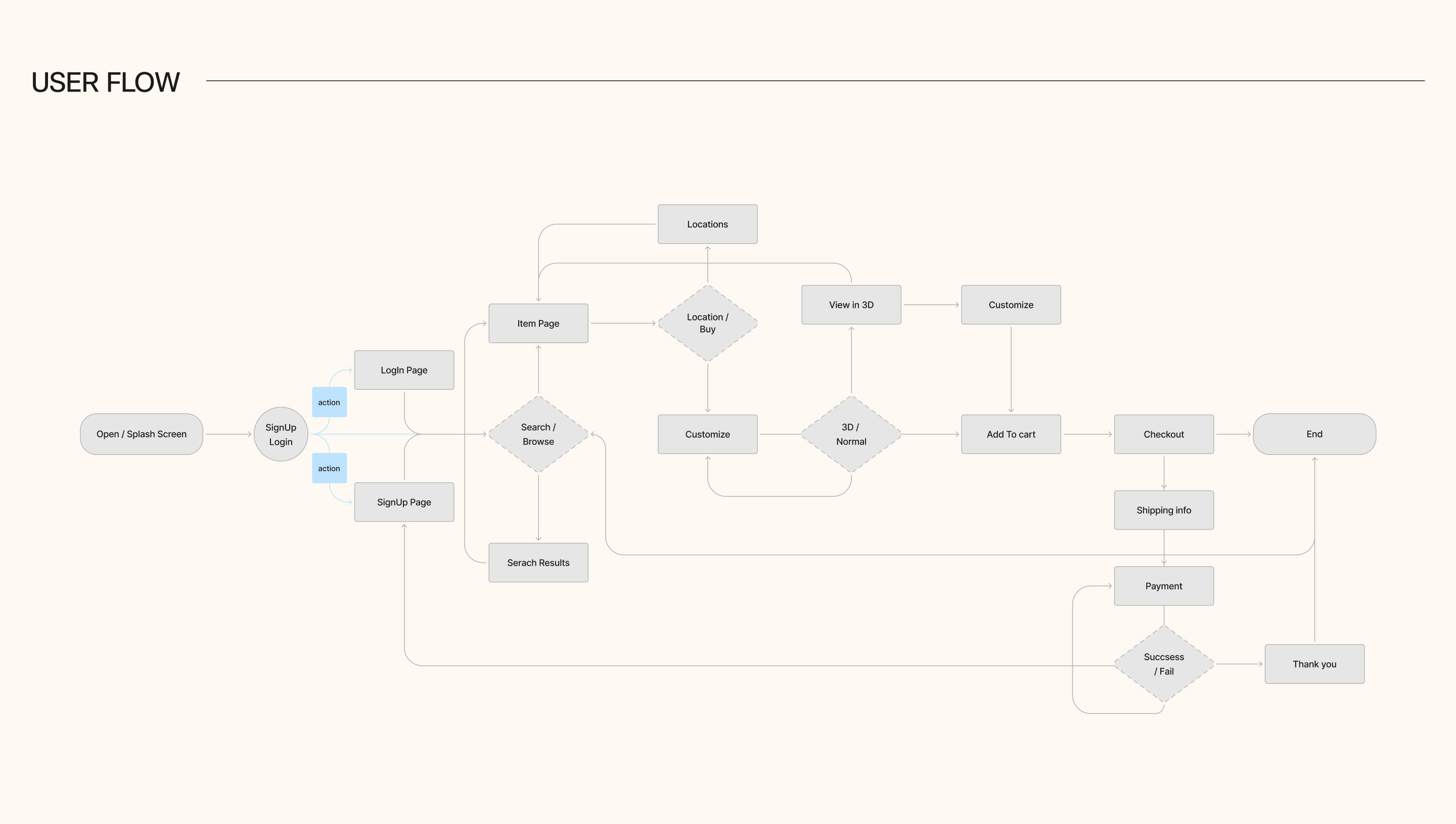
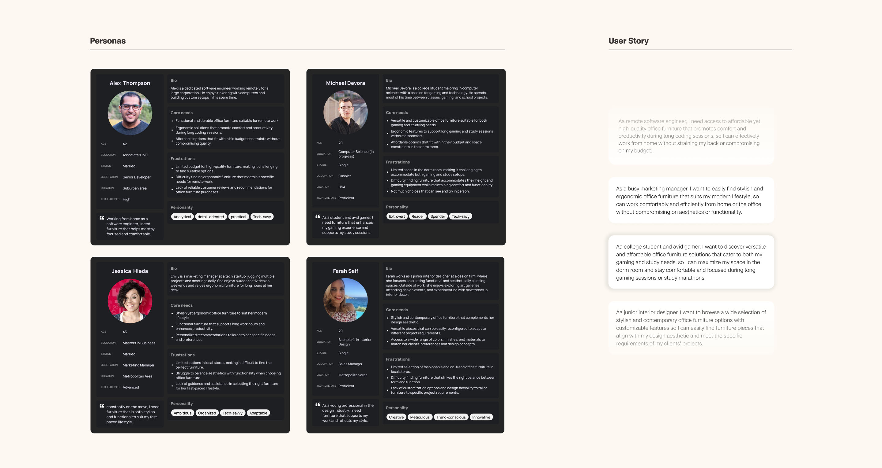
The existing mobile experience didn't reflect the quality of Steelcase's products. Navigation was buried, product discovery felt disconnected, and the path from browsing to purchasing lacked clarity. The redesign focused on removing friction at every touchpoint.
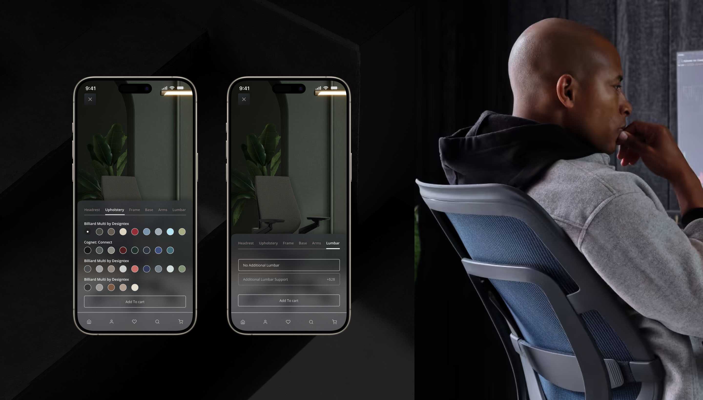
We restructured the information architecture around how customers actually shop — starting with clear category navigation, simplified product filtering, and a dealer locator that surfaces relevant showrooms based on proximity. Every interaction was designed to reduce cognitive load while maintaining the depth expected from a catalog of this scale.
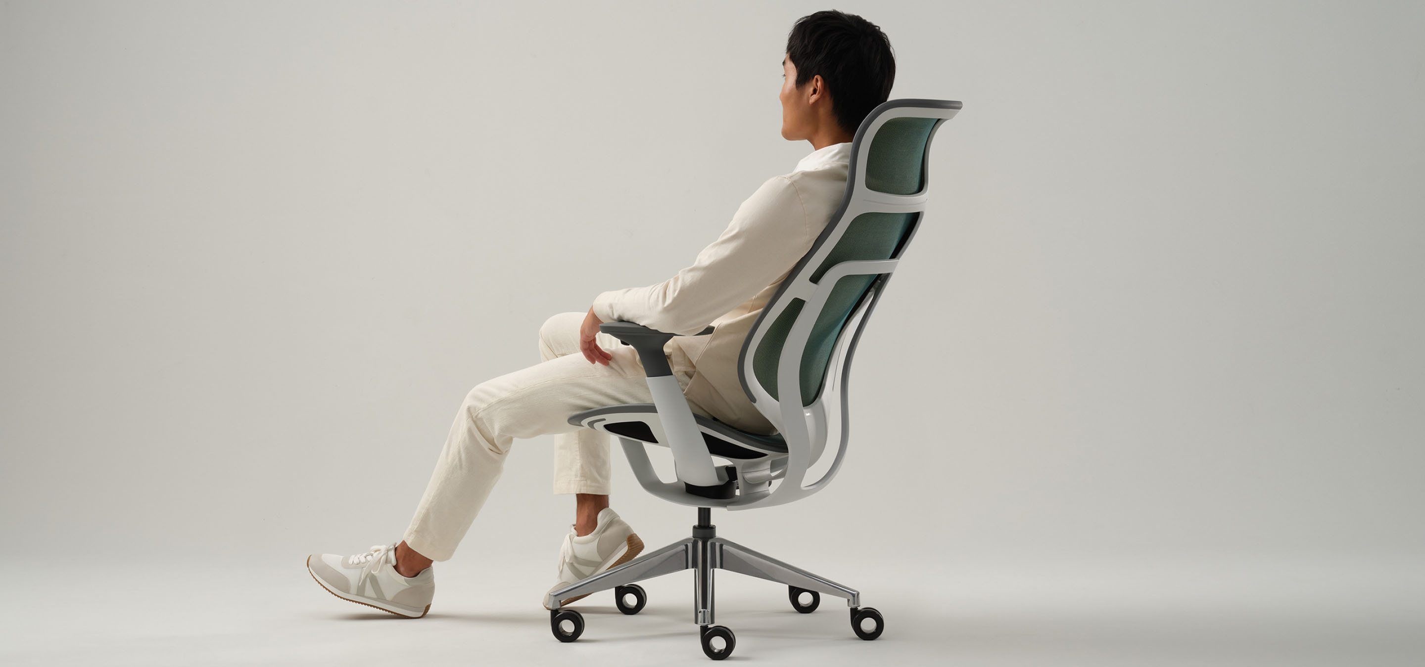
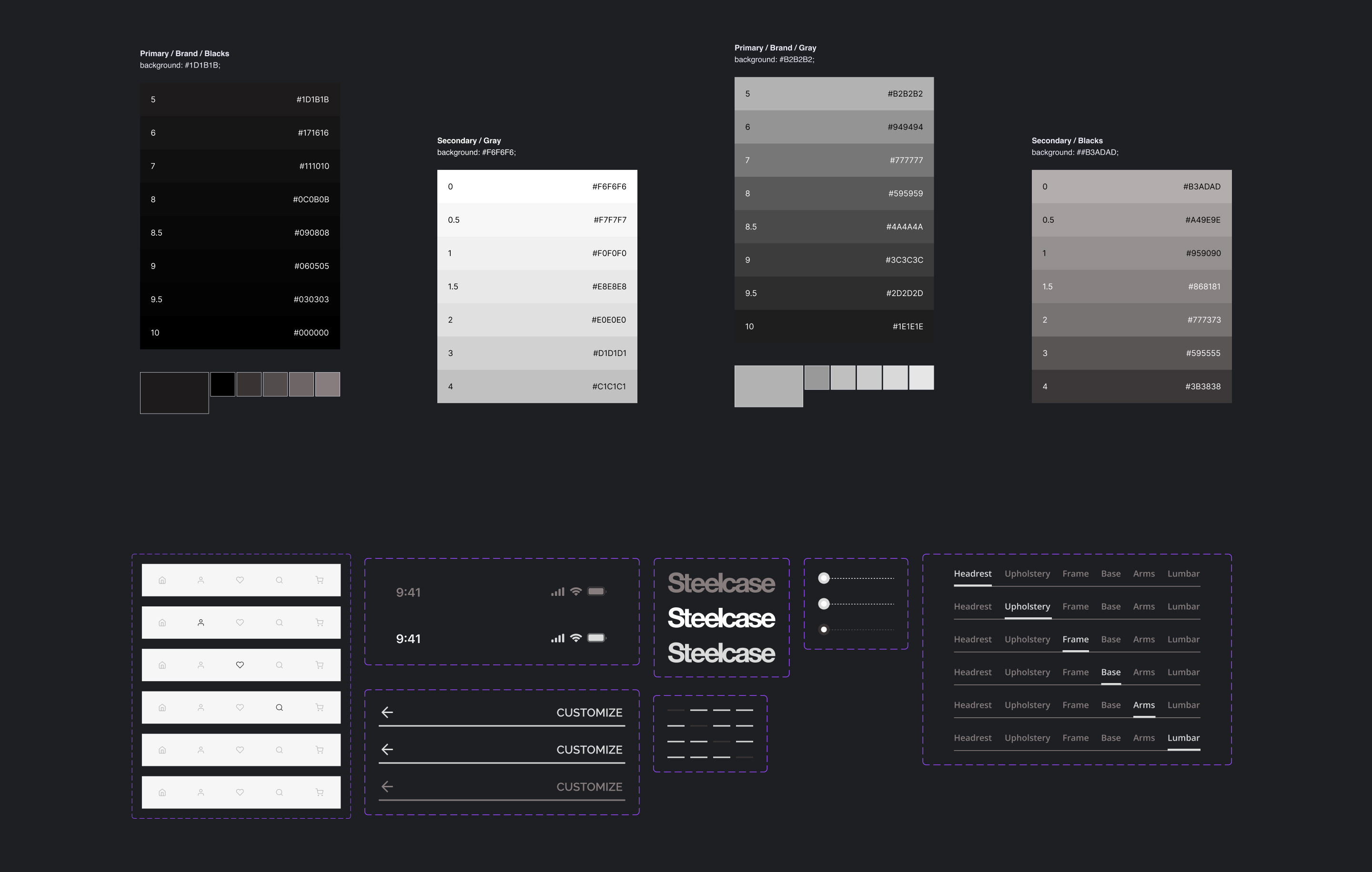
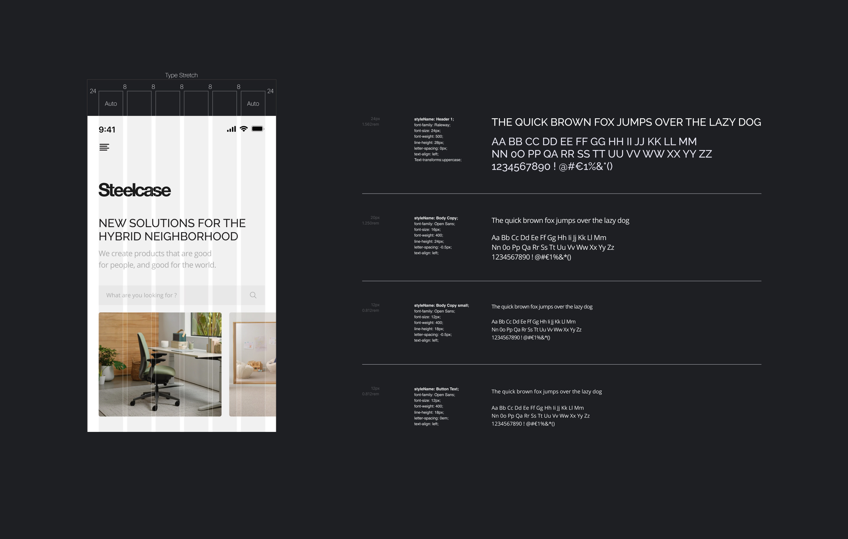
The visual direction maintained Steelcase's established brand language while introducing a cleaner, more contemporary mobile aesthetic. A restrained color palette emphasizes product photography, allowing the furniture to take center stage.
Typography was scaled for mobile readability without sacrificing the editorial quality Steelcase is known for. Interactive elements were designed with generous touch targets and clear visual feedback, ensuring the experience feels responsive and intentional on every device.